Monument 10, Concrete Steel 2019 – Studio Payoka by William Leggett – A beautiful piece of art made from the harsh material of concrete. Concrete and natural stone surfaces can be processed manually or mechanically with the help of modern processing methods such as water jet cutting. It is now possible to produce a wide range of shapes from strong stone material. Perhaps once viewed as a commercial material for the foundation and structure of buildings, having this material made into a piece of art to be displayed is controversial to its past meaning. Yet the artist stays true to the material by making art which compliments the hard tense stoniness. William is an artist who uses steel and concrete to produce complex futuristic sculptures and has pioneered the use of Beton Brut (Raw concrete) from which the term Brutalism comes from. Brutalist architects valued the rawness of materials – promoting the “Truth to materials” Beton Brut is a style which leaves cast concrete unfinished, displaying it’s imperfections, lines and seems which are imprinted during the formwork (casting process).
The steel is not visible making the concrete material the star of the show within Leggett’s designs. The complex structure is heavy and strong, yet it starts life as a composite material with a paste like consistency which gradually hardens over time. The design is purely focused on the material, with no coating, paint or finishes, even the plinth this stands on is the same concrete material. This could be viewed as bland, however I feel there is something captivating and magical about the organic raw finish of a material with its natural imperfections for example – an air bubble or chip, a blemish, changes in colour, all these elements add to the depth and beauty of this artwork. The design compliments the material by adding further texture making William and craftsman of honour to his chosen material.
Structure made of concrete and steel
Concrete Art
Metropol Parasol, Seville, Spain by Jurgen Mayer – One of the largest Timber constructions in the world. The Parasol is made from interlocking timber with a polyurethane coating which is held together with glue and steel connectors, all of which are on show. The materials used, which include a steel frame are clear to see, they are not faced with further materials to hide the connections between pieces of wood or where wood and steel come together. The finish is raw and simple yet the design and shape is complex and admirable. It is clear that this structure is made from interlocking pieces of wood, not something which is generally used in a building and the joins and workings of a structure are not so often exposed. I don’t believe that ‘Truth to Materials’ is Jurgen Mayers ethos in all projects but with the Metropol Parasol he lays his materials and components bare.
The Royal National Theatre,London, UK by Sir Denys Lasdun – One of London’s most divisive Brutalist buildings. Made of layered concrete, completed in 1976, the Royal National Theatre stands on the South Bank of the Thames. Internally and externally, the rough-cast concrete surface of the National Theatre shows the imprint of the sawn wooden planks used in the casting process, which were supposedly each only used twice, once on each side. Prince Charles famously described the structure as a nuclear power station, despite the vast criticism the Royal Theatre may be the most beloved Brutalist building in Britain due to its generous public space and the respect it offers to the surrounding city. Lasdun described architecture as ‘urban landscape’ and investigate ways of inserting modern buildings into the traditional city scape. I don’t necessarily believe Lasdun’s ethos was “truth to materials” for this particular project alone. I think his focus was on bringing people together in a public place to witness dramatic acts but perhaps his raw materials and brutalism which was used in his design was to take the focus away form the building itself, bringing the focus of the space about the people and the experience. Such philosophy is backed up by his vision of the public spaces of the design as a kind of fourth theatre where the members of public ‘acted’ their daily lives.
Denys Lasdun
Photograph by Luke Hayes Brutalist architecture Interior
Even the board-form concrete extends to the interior of the theatres, where the textures are exaggerated to baffle sound. Development of the interior forms of the theatre spaces drove much of the design process for the building.
Lasdun was awarded the Royal Institute of British Architects Gold Medal in 1977, likely due in large part to the successful completion of the National Theatre.
Rory Menage, is best known for his figure based sculptural works made in a range of materials – limestone, iron, bronze, wood and alabaster. At the centre of Menage’s practice is an investigation into perceptions of the human figure and the place of object making within our digitally dominant time. Themes of scale, weight, and digital manipulation are crucial to his work, which he makes. While there is no direct mention of Menage’s ethos being centred around the ‘truth to materials’ theory, his artwork displays the beauty and natural elements of his chosen materials which are only possible in a non-digital world. The materials he uses are enhanced by his tools and designs, adding texture and layering, yet allowing the material to speak for itself. The polished bronze statue named Girl is one of my favourite pieces, I love they way this organically interacts with light and reflection and how the design highlights different surfaces yet this is made from one solid manipulated piece of alloy. He gives human form to these different materials perhaps guiding us to see them in a different light, allowing each material to speak its own language.
Carved Shabti I 2019, Alabaster
Girl – Cast Iron
Girl – Polished Bronze Head of a Colossus – Cast Iron and Steel
Barbra Hepworth was also British sculptor who ‘became leading practitioners of the avant-garde method of Direct Carving (working in the directly chosen material’ (Tate, 2019) and whose works were among the earliest abstract sculptures produced in England.
Parent I, Parent II and Young Girl – ‘The Family of Man’ Series – 1970 Bronze
The patina of the bronze is art in itself, they are oxide layers that form when the reactive metals come into contact with anions (such as oxygen and chloride ions). To me this would appear to demonstrate ‘truth to materials’, allowing the metals to keep the art alive by forever changing oxidisation and giving the sculpture itself imperfections on shape and angles.
Image II – 1960
Hepworth worked on a variety of materials, sculpting, welding and moulding, creating sculptures which display the ethos of ‘truth to materials’.
Mother and Child
You can see the materials used to create her sculptures. Mother and Child are made from alabaster, displaying the mineral markings with their own imperfections and organic textures and colours. The pieces appear to be separate however there are no fixing methods as they are carved from one piece of alabaster.
Upon looking back over my work to date, the shape of a triangle significantly stands out to me. Layers of different shaped triangles over lapping one another with their sharp, unforgiving edges can be seen throughout the entirety of my chosen space, creating wonderful depth and texture. The use of triangles within my model do not just represent the visual aspect of the space, but also the raw materials used in the space (such as concrete, timber and steel) and the impact this has on the atmosphere. Some parts of the space are dark, cold and ridged just like an icicle which is also associated with a triangular like shape.
Base of my model – made from wooden sticks and glue
Model Base
The spacing in the model represents the vast entrance to my chosen space and the age of the building. My space is an old building with many holes, bodged repairs and gaps within the ceiling and floor, a large space for the elements to coil around and produce noise which adds to the experience and atmosphere. The top half of the model, which rotates, represents not only the wind element and air movement of the space but also how I feel when I am moving through the top half of the space. I feel like I am being sucked into a rotating vortex of wood and glass. The below half of the building for me is dark and mysterious yet the upper half of the space, which floats in the middle of the building (Mezzanine Floor) and is inviting, bright and overwhelmingly impressive, yet the space is one and all made from the same materials. The only difference being when situated on the Mezzanine floor you are closer to the infamous curvature of the ceiling. The upper part of the model therefore represents these conflicting zones/levels, emotions and connection with the space by using the same triangles as used in the lower/base part of the model and positioning them differently within the upper part of the model to create a conflicting shape. By layering the straight edges of the triangles on top of one another and moving them slightly at an angle each time creates the illusion of a curve resulting in a transformation. Much like the conflicting atmospheres experienced within these different areas – dark becomes light, hard becomes soft, rough turns to smooth, cold turns to warm, apprehension turns into excitement, and anxiety fades to calmness.
The lighting within this space has a huge impact on the atmosphere. The majority of my chosen space is naturally lit via hundreds of glass windows situated in the roof. The ceiling and roof of this building are the main attraction and this is also the case for my model. I wanted light and shadowing to be a big part of the model. Whilst incorporating the natural sunlight movement of east to west. I wanted to give the illusion of movement and change which represents the effects that light has in this space. The shadows range from sharp long strong patterns to short and soft patterns dependant on the lights positioning and interaction with the model. Resulting in a moving piece of shadow art which anyone can make, all you need is light. This represents the personal observation, interactions, connections and relationships we all have with space. For example I can share the exact same space with another person yet we may have completely different atmospheric experiences. Space and objects can be used to manipulate such experiences and feelings via atmosphere but there is always a personal aspect. Please see video for shadow art attached in the email.
Reflective Commentary
I found the whole process extremely enjoyable and magnificently interesting.
I found the Assignment (model making) a challenging experience as what I envisaged designing in my head was very different to the finished product. However, overall I am pleased with the end result and felt this captures various aspects of the atmosphere and experiences had within my chosen space.
I have learnt so much, I now look at a space in great depth. I now strip interior and exterior layers back to their bare materials (mentally) and take note of the positioning of objects and relationships between them, materials used and lighting. I find myself concentrating on how this effects the mood and atmosphere. I also consider if aspects of the space where to change and how this would impact the atmosphere. I find myself asking more questions when it comes to materials. And I have started observing how people interact with space.
I have taken a keen interest in geometric styles and patterns. I have also found a passion for the natural ageing of materials such as oxidisation and the colours and patterns this presents. I always look to nature for inspiration.
I felt confident in my understanding of the first part of this course, however I am unsure how long to spend on certain pieces and therefore am looking forward to a tutor reviewing my work in order to have some sort of guidance going forward. I then feel I can plan timescales better and understand the depth at which I need for certian projects.
Tutor Feedback
I am very pleased and perhaps a little relieved with the first feedback from my tutor. It is always nice to know you are on the right track and that my hard work shows via my learning log and sketches. I am also thrilled that my natural connection and love for this subject is also voiced via my work.
My tutor mentioned completing more in depth detailed plans as opposed to sketches, which include sharp angles, to scale proportions and cut through sections of buildings using tools such as grid lines to ensure plans, angels are precise. I have always been a bit of a perfectionist, and therefore can see myself getting lost in potential imperfections of definite, to scale drawings however, I am looking forward to including this in my work going forward as this is an area I am unfamiliar with.
I enjoy using black and white for my illustrations, however, my work does come to life when colour is added, this is another area which I need to improve on and experiment with. I sometimes suffer with letting myself go or potentially spoiling a sketch with colour and perhaps find colour messy at times.
I completely forgot to include human figures for my Assignment 1 model to give the design scale. I know see that my tutor had no idea how this design interacts with humans and what that relationship is. I tend to get lost in my own visions and designs and again must find a way to articulate this better to the audience.
There is also reference to adding in the views of other designers from research which for some reason I dismissed initially as I thought this may have been irrelevant however, I now see how this can only add to developing my skills on not only critiquing work but also on widening my own views.
Observing an occurrence or phenomenon that has become manifest in space through our senses.
Phenomenology is the study of structures of consciousness as experienced from the first-person point of view. The central structure of an experience is its intentionality, its being directed toward something, as it is an experience of or about some object.
Phenomenology, as a modern movement in philosophy, has focused discussion upon human subjectivity in new and critically important ways. Because human participants can relate intentionally to objects of the world consciousness manifests relationships to things and others that are other than cause-effect relationships. Consequently, the concepts and practices of the natural sciences are not the best model for the human sciences to follow. Husserl in his philosophy introduced a method for a more adequate approach to the achievements of consciousness and when properly modified the phenomenological method can serve as the basis for the human sciences. The use of such a method can make the qualitative analysis of phenomena rigorous and scientific.
Analysing my chosen space (No. 3 The Slip) using my senses: The size of the space is uncomfortably large. The room height is one of the defining components within the description of this space. The space appears monumental as opposed to smaller spaces which could offer a sense of protection and intimacy even oppression. The vast open entrance emphasises tension. The open plan space is so large it is hard to make out the entire contents of the building from one location, which again could trigger apprehension. The space is usually cold and dull due to the vast opening and small windows and therefore has no sense of homeliness or liveable meaning. The floors are bare, cold and made from concrete. Original walls and timber frame still stand with cracks and holes throughout, with no excuses, no apologise, bare, dirty and dusty which again portrays an unwelcoming, uncertain sensation. Yet upon entering you are greeted with arrows and roped pathways which is a clear indication we are wanted within this space, we are welcome. This in turn gives a sense of acceptance and fortune – I am fortunate enough to be entering this building which appears to be uninviting to me from the outside.
The building seems to be fighting its ever maturing structure, this is made evident by the repairs throughout the space but perhaps this is due to the dank smell or is this because I feel its old in human terms having been built over 182 years ago? This gives the building a personality for me and even a sex – an old masculine building unapologetic yet content with its being, a building made for building which once held thousands of working men during the industrial age, this whole building highlights that in its appearance, smell and noise. The space welcomes visitors to follow a roped path around the space but doesn’t want them to stay for long. There are no inviting areas, no chairs or coffee shops and no warm inviting textiles or furniture.
The properties and visual appearances of materials and surfaces trigger subjective responses. All contributed by the lighting, temperature and noise. Each visit can provoke a slightly different reaction and relationship between the space dependant on our senses perceived. Such senses may differ from day to day due to the ever changing surroundings we have no control over for example temperature, noise, weather. The weather affects the lighting within this space; when this building is full of sunshine it seems to be at its happiest, beaming lights shining throughout the space filling it with a warm magical atmosphere. However, when the weather is raining windy and cold, the space is dark, frigid and full of the howl of the wind outside. Subsequently resulting in a different connection to the space.
At the centre of all space is the human being. That space is directly and individually perceived via our senses. I adore the fact that another human can be stood next to me in the same space at the same time yet we could each have a very different connection to the space.
Exercise 2.1: Soundscape
The main noise within my chosen space is footsteps and gentle chatter. The loudest noise’s being that of children playing including perhaps laughter and sometimes crying. The very loudest being the steam train which runs just outside the building on the weekends. I decided to record the sounds of my chosen space, on the day when the steam train is present, with a watery based paint, I flicked my brush at the page whenever I heard noise and the louder or more prominent the noise was the more vigorously I flicked the paint at the page. I would of liked to have used different colours for different sounds but the sounds all roll into one, there is no time to change colour. The results are below:
Paint flicking for sound – I found this harder then I imagined and sometimes struggled to keep up with all the different sounds.
Another slightly different paint method
I also used a basic pen and paper to record a different day within my space. There seemed to always be some sort of sound, never silence. Whether this was the wind outside or the gentle whisper of a visitor:
Pen and paper for sound
I took some video recordings and listened to them over and over and used a different colour paint each time.
I tried to think of a different way to record the sound and I came up with an idea of channelling this via my phone by closing my eyes and randomly taping my keyboard on my phone, the results are below:
When I heard a singular sound my finger seemed to remain in the same place as you can see by the repetitive letters.
On completion of this exercise I was astonished by how much sound can effected the atmosphere within the space. My chosen space is a shell, with no sound absorbing materials. The acoustics are determined by the materials and surfaces used within the space. Therefore the bare, hard timber frame of the building must enhance sounds perhaps make them echo or seem louder then they are all adding to the atmosphere. The famous curved roof of my space must also have an effect on the sounds.
Exercise 2.2: Touch, Smell & Emotions
Smells, touch and sounds via drawings.
I recorded my findings in 3 separate areas of my chosen space – The Entrance, the mid section and the Mezzanine floor. My drawings of the smell, touch and sounds I experienced within the space are below:
Entrance
Entrance – the entrance is vast, a huge wide opening which allows the elements in. Its cold, the floors are hard similar to a pavement yet you are inside a building. This area is quite. The sheer size of the entrance is surprising perhaps causing a sense of unease. I have tried to reflect that in my drawing above.
Museum section – Mid section of the building
The mid section of the space is full of old industrial and war machinery. The smell of musk and oil fill the air. The temperature is warmer here as this is situated further inward away from the vast opening of the entrance. Sounds are reflected off the machinery and therefore seem closer. I feel a sense of busyness, commotion, hard work, labour and I can almost smell the sweat. This is a masculine part of the building, the smell of the timber frame rotting away is noticeable here. This was once a thriving industrial work shop. The connection of war instantly brings a sense of darkness, sadness and loss – perhaps creating a stressful atmosphere here. My feelings seemed to be manipulated by the arrangement of objects and signs.
The Mezzanine Floor
The Mezzanine floor brings a contrasting atmosphere in comparison to the other areas of the space. The huge cascading ceiling is full of hundreds of windows which are highlighted by the day light creating a magical connection with the outside and the sun. This area is bright, warm and filled with light. The space is huge and open making one feel incomparable to its surroundings yet its inviting and exciting. I feel small here, insignificant yet overwhelmed by the beauty of the space. I feel happy and lucky to be able to experience such space. I feel comfortable and free.
Entrance, Mid section of the space and the upper level combined.
My drawings of the 3 separate areas within the one space placed together show very different atmospheres and feelings. A lot changed between the different areas. Layers of elements contributed to the atmosphere in each space.
Exercise 2.3: Form & Light
The lighting within my chosen space changes continuously depending on the respective artificial and natural lighting situations both within the course of a day and seasonal. The atmosphere changes drastically within this space dependant on how bright the sun is and at what position. On a dull and miserable day the space is plunged into darkness. Such a vast space is hard to illuminate artificially from ceiling lights alone. On a sunny day the space is transformed into a hazy bright twinkle show. I took a video of how the light reacted throughout the space and how it reacted with objects within. My favourite was watching the light move through this war submarine. This submarine was recovered from the bottom of the ocean after being struck by a missile. The decaying of the metal has created thousands of tine little holes which the light passes through creating a delicate light show which can be amplified by my own movement.
Light Show
A similar scenario happens on a lager scare via the hundreds of windows cascading around the space. The sun fills the room with blinding light bleeding into the structure and architecture of the space.
Being inside the building on a sunny bright day when the sun goes behind a cloud, the space instantly tells you. The room is cascaded into darkness. Light plays a huge role within this space. Functionally, when this space was used for building, workers would have required as much natural light as possible, and the natural materials they would have been working with would have perhaps needed sunlight to expand and settle, hence the deliberate reason for hundreds of windows. The deliberate orientation, size and position of the windows (directly above, 360) are towards the sun in order to achieve the best possible utilisation of daylight and equally to protect the interior against overheating and glare. Light from above is brighter while the light entering through a side opening only includes approximately 33% of light emitted from the sky, a rooflight may admit up to 100%.
The windows create many different shapes and colours throughout the building. Light is reflected onto the floor here.
Light beams
I can almost imagine the different paths of light beams and rays piercing through the windows and crowding the space creating a continuous sharp edged pattern continuously passing over each other and bouncing off different surfaces within the room like a laser field which fits in with their surroundings, resembling the structure of the space which also has continuous triangular sharp edges.
A section of the space mirroredThe glare and smudges. Bleeding light.My drawing of the main source of light within this space which is via the hundreds of windowsGloomy Day Sunny day
Gloomy vs Sunny/Light vs Dark.
The lighting within the space on a sunny day vs a cloudy day.
The atmosphere is completely transformed within this space as the main source of light is derived from natural sunlight/daylight having an instant effect on my emotions. Sunlight is associated with happiness (Mr Happy is even shaped like the sun and is yellow), making the space comfortable and warm and exciting. Towards the afternoon, on a sunny day, red and orange colours fill the space as the sun is setting making the space relaxing and clam. During a cloudy day the space is suffocated by darkness, elevating the musky damp smells creating a sense of unease and coldness.
Exercise 2.4: Material
My chosen space is full of hard cold materials. The building is made of Timber, the windows are glass and lead and the floor is concrete. I believe the roof is made of Zinc but I cant find clarity of this online and the space is now shut due to Covid 19. The structure also bares steel supports and a roped pathway. This space really is quite minimalistic as there are no inner rooms, insulation or interior structures apart from the mezzanine floor.
The space is made of heavy weight construction materials. The shell remains exposed to view. It is clear the materials enhance the atmosphere and effect of this space. They play a clear role in the acoustics, climate and energy factors. As this is such an old building the design would have depended on availability and processing options of materials. Todays perception of the materials used here are viewed differently. Polished and unpolished concrete floors within residential spaces such as kitchens are now a common occurrence as a statement piece and perhaps viewed as luxurious, where as bare concrete floors within a residential space 15 years ago would of been viewed as barbaric, unfinished, harsh or in a state of repair or renovation.
Bare Concrete flooring.
Cold hard surfaces
I am obsessed with the natural oxidisation process and the beautiful colours and textures it provides
Time is apparent on the materials used throughout, the oxidisation of steel (which I am obsessed with) the rotting of the timber wood and changes in colour of materials due to sunlight and temperature. However they all seem to connect in harmony, all heavy duty industrial materials which suit their huge surroundings. The colour palette is small, consisting of dark, masculine colours with lots of browns, greys and rusty oranges all having an effect on the atmosphere of the space.
Exercise 2.5: Visualising Atmosphere through Sketch Models
My concept ideas
Experimenting with geometric shapes, similar to the timber frame of the space.
This structure creates beautiful forever moving shadows. The suns natural movement throughout the day would create wonderful gematric shaped shadows similar to the timber structure of the space. See video.
The colours represent the temperature within the space – Blue symbolising the cold surfaces of the flooring and the warmer colours representing the windows and natural light. There is no opening nor finish to the structure as this represents the vast entrance of my chosen space and the infinite size.
Movement and shadows with longer trianglesRotating this shape creates different shaped shadows representing the movement throughout this space. Due to the vast entrance and empty shell of the building it feels open to the elements such as wind. The noise of the wind is enhanced by this space and has a huge impact on atmosphere. See Video.
Exercise 1.5: Visualising Experience through Sketches
A visual map of my chosen interior space. This includes the most important findings from my collection of data from my previous exercises. Map and Plans with feelings and emotions during visit
Model map of No.3 Slip
Floor to roof – Quick sketchEntrance and Exit – Vast openingFront, side and Birdseye view
To scale floor plan – Ground Floor
3D Ground Floor Plan – (To Scale)
The visual map at the top of the page shows the plan of the space and includes all the layers which make up the atmosphere of the space. Including different feelings, emotions and body language. One thing I have noticed is an atmosphere in one space can be experienced differently for all. Space is made up of structure, material and a function combined with individual experiences and memories. Event though it should seem easy to work out the function of a space, the meaning of space is not determined solely by its function. The sense and perception of a space is largely affected by subject attitudes. When observing the behaviour of others within my chosen space, I found myself assuming other visitors would have a similar, if not the same, train of thought as mine in the sense of appreciation for particular objects and architecture. However, after close observation of the behaviour of visitors they all seemed to follow their own unique path, all influenced by their own memories which creates relationships with their surroundings. Every space arouses a sense of comfort or discomfort which is directly and individually perceived through our senses – seeing, hearing, smelling, touching and the sense of balance. The properties and visual experiences of materials and surfaces trigger subjective responses. At the centre of all design considerations is the human being. Although I cant help but feel like throughout this gigantic space a lot of consideration was given to the ships it intended to help build and create. A building for building!
Mezzanine Floor
One area of the building which amazes me is the Mezzanine floor of this building. Each time I visit, I cant wait to get to this section of the building. When I first experienced this space, I felt an overwhelming urge to photograph it. A twirling wonder of windows, materials, textures and colours. The way the Mezzanine floor floats in the centre of the building, suspended by huge timber supports, makes the roof seem like a continuous round arch wrapping around the floor, just like walking through a kaleidoscope. I experimented with the Mezzanine photos I took by placing them into a photo editor and the results are outstanding. I think I have a strong connection with geometric patterns. I am obsessed with the interlinking triangles and also the organic colours of rust. This for me sums up how I feel when I walk through this space…….
A map of my route taken throughout the building. The stair entry to the Mezzanine floor is currently closed which was disappointing. I felt annoyed by the black and yellow tape closing off this area with no sign or explanation why?
On previous visits I have been allowed up to the Mezzanine floor, these are drawn from memories and pictures I took whilst exploring this area. I remember a sense of excitement and amazement at the empty space making me want to act like a little child and run around taking in all the space. Yet confused as to why this is an empty space when it has such a spectacular ceiling and roof. Lots of triangle shapes and continuous geometrical patterns. A mash of windows, sunlight, wood and shadows.
Diagram of how my head feels when walking from one end of the Mezzanine floor to the other.
There is one entrance point to the Mezzanine floor (via a lift and stairs situated next to each other) and two exits, one via the lift and one via another set of stairs directly at the other end of the full stretch of mezzanine floor. There is a clear path to walk from one end of the Mezzanine floor to the other, this reminds me of some sort of vortex tunnel. The Mezzanine floor is situated high up in the roof of the building and therefore right in the curvature of the structure, which feels like a infinite cascading wall of windows, sunlight and timber triangular frames. Sometime I experience mild vertigo when visiting, the room constantly feels like its is moving as when you move other rafters, bits of wood and sunlight are revealed. There is so much to take in here. I feel in awe of my surroundings which takes me to a reflective and questionable state of mind…how, why is this space here. I am always confused as to why this space is empty yet I have no idea what could fill this space without taking away the appreciation and concentration on the building itself this emptiness brings. Personally I love that this space is empty it makes me look harder at my surroundings and appreciate the beautiful architecture.
Pathway and roped off areas.
The different materials used within the building all seem to make a beautiful colour palette.
This photo is exactly why I love this building so much, the building is so vast it almost plays tricks on the naked eye. The Mezzanine floor seems to bend here.
Rotting wood perhaps? Are these strong enough to take my weight?
I thought about recording how many times I looked up during a visit, however as I would be conscious of this it wouldn’t be a fair and reliable experiment, …perhaps I shall practice this on a visitor for the next exercise – Observe behaviour 1.4.
You can see why from the pictures there are so many reasons to constantly look up and around there seems to be items and objects everywhere, messy chaos. But they seem to suit their surroundings. They are all rusted, dusty and unloved yet supposedly on display. This reminds me of the meaning and purpose of this building. This was not a building meant for showing off this was a building built for building. The war machinery, weapons and boats reflect this genre. There is no great care that has been taken in the displays and settings, no carpet, no curtains, no chairs, no pretty paint jobs. Old bits of dusty rope are used as a border for a pathway which guides you around the ground floor of the building. Objects of importance are categorised by giant military sized labels which hang from the ceiling, which again suits the theme and stands out.
The air is heavy and cold with a strong smell of damp, oil, and musk. This makes me feel closer to the time at which this was a thriving working hub, full of hardworking men building and working away, no luxuries, no excuses, long hours and low pay. Perhaps with similar smells such as the unforgiving smell of manual labour, sweat, oil and steam.
The concrete floor on the ground floor is bare and cold. Some odd bits of old industrial machinery lay on this floor, not strategically placed just dumped without any personal label or indication of what they may have been used for. This makes me perplexed as to why they are here but arguable they seem to be in the right home for them, after all they are industrial pieces of old machinery, rusted and dusty? However the name printed on a large tag situated directly above them reveals enough to change this feeling. The tag reads ‘Boring Machines’, this instantly removes the feeling of confusion and annoyance and replaces it with a relaxed atmosphere, fun, accepting, amusing and welcoming. All this from two words.
The lift and stairs to the Mezzanine can be seen in the background. Machinery is displayed yet with no labels.
All objects are beyond the old rope border, which I assume is the ‘out of bounds area’ although there are no signs to state this. Some objects of importance having plaques to explain their stories and meaning, other objects are left nameless without a story. Yet are still given the chance to be displayed here. The ground floor is one big open space, although objects are zoned off and categorised by large tags. The rope although old and dusty offers a straight forward, easy path to follow making me feel confident in my direction and movement within the space perhaps even safe allowing me to focus on the display and surroundings more. I feel welcome throughout the entire space until I get to the Mezzanine floor entrance where there is a sign with an option for you as the visitor to miss out this part of the path, this makes me hesitate and question why. I feel a mixture of fear and confusion here but I am also intrigued. In recent visits the Mezzanine floor has actually been closed with yellow and black tape carelessly draped over the stairway entrance and a hand written sign reading ‘out of order’ hanging on the lift. I felt annoyed by this with no explanation as to why. I felt unwelcome and uncomfortable. I do not like feeling confused and uncomfortable.
All surfaces within the building are hard and cold, there are no soft touches, no soft furnishings. No seating area, no play area, no invitation to board any of the objects on display, no interactive involvement. Just a clear pathway to follow and tagged areas which section the open plan space into different zones. Information provided on plaques throughout the ground floor is straight to the point and no longer than a paragraph. This gives the impression that the function of this space is to be continuously moving and flowing with visitors. The roped pathway makes me want to follow and explore where it leads me to. Whats around the corner, whats next? This is not a space to be enjoyed for hours on end, its inviting yet it wants me to keep going, a space for quick observation and learning. The furnishings let me know what they want me to do in this space, without speaking to me and without the aid of signs. For example I know I am supposed to follow the rope and although there are no signs to say you may not venture beyond the roped path, I assume this is the case.
Exercise 1.4 Observing Behaviour
As the main entrance to the building is a vast open wall, with the entrance also being in the same location as the exit, the entrance has now been clearly sign posted and is situated on the right hand side of the building. Upon entering you are greeted with arrows and a roped path. The arrows and signs are a new installation due to Covid-19. However, observers and visitors now seem to be confident in entering the building, there is no confusion as where they feel they should and should not be, they are confident yet calm in their actions all as a consequence of a clearly marked sign/instruction. The function of the space is therefore clear from the outset …..we are being invited to enter and observe.
Entrance and Exit to No. 3 Slip
The magnificent vast open entrance and exit to the building.
Arrows to indicate direction of focus and space function for visitors.
The biggest similarity between adult visitors was the speed at which they moved through the space. Every single adult moved slowly and calmly and spoke quietly. Enjoying their time within the space and taking in their surroundings. I feel the visitors actions pays tribute to the atmosphere which seems relaxed and calm. Many couples held hands. Families stayed close to one another, interacting with both their surroundings and each other. Children seemed to move at a faster pace throughout the space, with excitement and carelessness, but every now and then they would conform to mimic adult behaviour and at times moving slower and stopping to appreciate certain objects. Children also made their own play areas by hanging onto the pathway ropes pretending to row a boat. There was a lot of pointing to one another to involve each other in the same amazement of what each observer had spotted and not wanting their company to miss out on their findings which emanates excitement and wonder. In some areas children raised their voices in excitement, which filled the vast space with sharp noises, again adding to the atmosphere. Each observer seemed to enjoy their flow throughout the building, each perhaps having a difference experience to the next.
Children playing on the ropes and imitating rowing a boat. The surroundings perhaps having an impact on their imaginations.
Everyone (all ages) stayed within the boundaries of the rope, not one observer crossed this rope. Why ….how do we know not to cross this rope without clear signs? We could easily squeeze behind this rope.
Roped off pathway
One section of the building leads to a small T junction like area. A visitor may choose to walk right, up towards the Mezzanine floor, or left, towards the exit. Most of the observers hesitate at this very point as I assume they are debating over which route to continue on, they become uncertain of the path they wish to continue on. Perhaps even anxious at the thought of missing out. We seem to like following clear instructions.
My interpretation of body movement throughout the building. There was a lot of pointing and a relaxed observation pose with the arms crossed behind and placed on the back.
A lot of visitors look upwards towards the vast space above and the beautiful shaped roof filled with twinkling windows.
I decided to record the upward head movement of a few visitors throughout the different zones of the building (see below). The arrows are colour coded for each zone and the longer in length the arrows are represents the more upward head movement activity there was in that particular zone. Zone 5 was a clear winner. Zone 5 is the Mezzanine floor as suspected this is the most upward head movement of the whole building. A lot of visitors didn’t even look up during their ground floor interaction within the building which surprised me. Zone 2 and 4 had the least upward looking observation which makes sense as this is situated underneath the Mezzanine floor which blocks the view of the roof and famous ceiling.
My recording of head movement during visitsHere are 3 different routes taken by visitors. The entrance and exit being situated at the bottom of the pages with the start being situated on the right hand side. Can you guess which one was a child…? = (Page 1 far left)I recorded the 3 different routes on tracing paper and when placed over one another they actually look like an old man with a crook.
Children took a very different path to the adults, they would often flit backwards and forwards between the path, excited by what lies ahead but held back by their parents/guardians taking longer.
The ignored sign
The sign pictured above is meant to be ignored isn’t it? But when I asked myself why I found this mind blowing as to how I came to this assumption. The visitors behaviour also concurred with mine, we all walked passed and ignored this sign. How do I know this isn’t meant to be taken note of ….. the positioning and the fact it is stored away and leaning on a wall rather than sitting prompt in the middle of a doorway/walkway. How we analyse the function of a space takes into consideration lots of different components, the majority of which I found I worked out without realising. This was a massive eye opener. Both myself and the behaviour of the other visitors mirrored one another to a certain extent, we all knew to follow the arrows, we all knew to stay on the path and not to go beyond the roped pathway, we all understood we have had a choice to walk on way or another at one point in the building and we all knew pretty much at all times where the exit and entrance was located. I believe the function of a space is made up of its contents. Without contents what is a space?
A sign which is clear and correct and to be noted due to its position within the building and its design which is bring used at its full potential. This sign can be collapsed and folded away …..a temporary sign.
For more than four centuries The Historic Dockyard Chatham was one of Britain’s most important centres of warship building and repair. Over 400 warships were built here, allowing the Royal Navy to dominate the seas of Europe and beyond. Today it is the world’s most complete dockyard of the Age of Sail.
No. 3 Covered Slip is situated within The Historic Dockyard. Built in 1838, the immense Slip, when built, was the largest wide span timber structure in Europe. Today it is home to a vast array of epic objects and vehicles from both the Chatham Historic Dockyard Trust and Royal Engineers Museum. No.3 Slip stands at the cusp of technological change, its amazing cantilever roof was built to the design of shipwright Sir Robert Seppings.
The building is now used as a combined display and storage facility to house large artefacts from the collections of The Historic Dockyard and the Royal Engineers Museum. These include a WW2 midget submarine (See video below), the Victorian railway carriage used by General Kitchener in Sudan and ‘Overlord’, a railway locomotive used in the D Day landings. It is now one of the world’s most dramatic museum open stores.
Due to the building being so large, the size is hard to grasp from photos without any content. I asked my two children to stand underneath the windows, in order to add context. My eldest is just under 5ft tall. They look tiny in comparison to the windows. The bottom of the window seal starts at approximately 10ft up from the ground. This is not a window made for peering in or out of.
The entrance is a vast open wall, this makes the building very welcoming and as previously mentioned in my last research on this building, I think having such an entrance attracts visitors attention. Visitors seem to turn to this building first when entering the Historical Dockyard which is made of hundreds of historical buildings, I believe its because of the vast openness of the entrance and the sheer size of the building. The flooring is disturbed by two different directed train tracks running through it which seem to disappear into the vast space inside.
Interior map of No.3 Slip
The building consists of a timber Frame, weatherboarding and a corrugated sheet roof.
The plan of the building is a U-shaped aisled single-depth. Single storey-ed weather boarded walls with wide, low small-pained windows. A very large mansard shaped roof has 2 tiers of continuous roof lights and is curved round at the entrance end with shallow hips and tiers of roof lights to each section.
Timber roofs were introduced over the dry docks in navy yards from 1814, because of the rapid rate of deterioration of timber ships exposed during construction to the weather. The trusses are supported by the cantilever effect of the overhang beyond the posts. At the time they were the widest roof spans in the country, and this is the largest of the three surviving examples, (the others are at Devonport, Plymouth).
There is a pathway which is to be followed on the ground floor, guided by ropes and arrows, this takes you around the various historical boats, weapons and machinery, it then leads you towards the upper mezzanine floor but the upper zone has a sign which clearly states you can miss this out as its not for the faint hearted due to the height at which the upper level is situated and I guess the raw floor (which in some places you can see through). By the 1850s the length of ships had outgrown the slipway and in 1904 the mezzanine floor was inserted to create a store for ships’ boats. The mezzanine floor is now a void space with no objects. Visitors can fully experience the grandeur of the roof here. It is a space visitors seem to use for reflection on the building alone, there is nothing more to concentrate on …I love this and I am not sure if this was the intention for this space since opening to the public (to be left untouched and empty) or rather it has to be empty perhaps due to the floor now being untrustworthy, can it hold weight? On my last few visits to the building the upper mezzanine has been closed to the public. I wonder if it is now unsafe for the public to visit?
Looking directly up at the mezzanine floor you can see the gaps in the flooring.
From both outside and inside the building you can see the exposed skeleton and the beginning of the structure. Another raw feature which I think is both beautiful and educational. In fact the structural support of the building resembles bones in certain light. Such structural supports are typically hidden by an extra layer of construction such as plaster, brick, concrete, paint etc.
The interior consists of a enormous timber frame of square section timber aisle posts with iron bases and knees, diagonal braces, to cantilevered principal rafters that extend out to overhang the aisles, and braced collars. The skeleton of the building resembles a rib cage. The continuous patterns, light and slight curvature remind me of something you would see when looking into a kaleidoscope. There are two main areas within the building which consists of the ground floor and the upper mezzanine. Certain areas are roped off and out of bounds. The building seems to be running/moving in all sorts of different contrasting directions. Although parts of the building have a curved appearance, the curves seem to be made from strategically placed straight pieces of wood. Different sections of the building seem to be travelling in different directions. There are so many different layers. You can see how raw and fragile the upper level flooring is from below. Lines over lines…all moving in different directions. The walls are just so huge and overwhelming, they all seem to be leading upwards towards the glorious ceiling and roof of the building. You cant help but look up! Although this building is industrial and raw it still has so much detail and layering.
Cold, bare concrete.
The height, curvature and continuation of windows makes observers unsteady on their feet. When looking up you expect to see an end to the wall, yet the walls seem to cascade over and above the centre of the building and back down to the other side. There is a continuous flow. Triangles galore The beautiful and complex joining of the building.
Above are birds eye view sketches of the huge building which resides right along the river Medway. I assume the building is approximately 50 metres wide and at least double this in length (100m).
The objects stored within the building such as historical boats, lifeboats and war machinery look at home in their surroundings. The building and its contents are of similar age and all seem to have a connection with war. The building is full of damp and musky hues, which again suit its purpose. It resembles that of a museum where any historical objects are kept. They all seem to come with a distinct sharp musky odour which for me heightens the atmosphere and causes a reflective state of mind on the history of the people that interacted with such objects and the stories (both happy and sad) they hold if only they had a voice. How have they ended up here? Why have they ended up here? At the end of the pathway one of the very last objects to pass is a midget submarine – See video.
The building is cold and inhabitable due to the huge wall opening entrance, used concrete floors, damaged structure, gaps, cracks, breaks in the glass of the windows, chunks missing from the walls and flooring. There is no heating or air conditioning, no seating for visitors yet the atmosphere feels welcoming perhaps due to the roped pathway which acts as a guide around the building, as if the building has nothing to hide, its stands proud of its scars and imperfections which adds to the experience. There are no private areas, no rooms just a ground floor and a mezzanine. It is one large unforgiving space which has been kept alive by unloved repairs here and there which are visible all throughout. Holding historical war objects within a building which created war ships, and was home to many craftsman and hardworking individuals only adds to the atmosphere, creating a stronger connection for the visitor. Not only the objects held within the building are connected to the war but the building itself had a huge involvement. However, not one of the objects overshadows the building itself, this is by far the star of the show. Leaving this space untouched and what feels unfinished again draws visitors to the attention of the surroundings.
I love the fact nature has taken hold of the back of the building which faces the river. There are no windows to view the river view nor any indication when inside the building that it is right on the river. I assume the entrance to the river was blocked up, as the whole meaning and purpose of the building was to construct ships along the river side so once built they can then ‘slip’ into the river and out to sea. This side of the building is completely off bounds, I am off to the other side of the river to take a sneak peak at this side!
Such a beautiful open space, with so many stories to tell ,if only it had a voice.
13/08/1908 C17 Submarine Launch – You can see No. 3 Slip here in the background on the far right. The end of battleship construction marked the dawn of a new era for Chatham as the Royal Navy began to embrace the submarine as a new weapon of war. This is a picture of the launch of the first submarine that was constructed here. In all, 57 submarines were built at the Dockyard between 1908 and 1960.
No. 3 Slip Exterior sketch. (Laura Woodgate)
A photogenic space filled with history. A gigantic listed building which is of both special architectural and historical interest. Its considered to be of national importance and subsequently worth protecting. This building must be difficult to keep alive due to its sheer size, age and unusual structure. Restoration can be seen throughout the entire building. I wonder how long this building will stand for and how long the original timber used will last?
A place of Christian worship since AD604. This is the oldest building I have ever set foot in (to my knowledge) and one of the main reasons why it intrigues me so much. This is a Grade I listed building and is the second oldest Cathedral in England. The present building was initiated by Bishop Gundulf in 1080 (A carved statue of him currently dons a Covid-19 face mask as shown below). The architecture is Norman, Gothic and Early English Perpendicular with a fine crypt, medieval wall paintings and a magnificent 15th century chapter room doorway. This religious building is full of wonder, mystery and history.
Rochester Cathedral – Exterior
Flooring – The contrast of repetitive clashing patterns within a border. Every inch of this building has strong craftsmanship and forever has me reflecting on how long individual pieces took to design and complete. What tools where used?
The Choir area- This reminds me of an American 1920’s speak easy, dark wood against rich, deep red and greens topped with low lighting. I find this highly amusing that a place of worship can strongly resemble such illicit establishments. I wonder if this Cathedral has ever been subject to similar skulduggery?
The Medieval Crypt – A lonely cold area situated at the back and beyond of the cathedral. Equally breathtaking in architecture but the ceiling height changes dramatically in comparison to the superior height of the Cathedrals main entrance. All visitors seem to be on their best behaviour throughout this religious building, as if they are in the presence of god. Could it be the architecture that influences this….?
Gigantic windows the same size as the front of my house, yet they do not look out of place. God size?The main hall is breathe taking, creating an impact of monumentality. The height is unnecessarily high, yet this may have been constructed for capacity and climate since church is a congregation space where a lot of people gather to pray, perhaps ceilings were designed so high to meet the scale of the same. Conceptually, churches were the most important structure in a city in ancient times. The height makes me feel small and powerless perhaps how one should feel in the presence of a higher being?The walls are made of Stone and Roman Brick. I adore the organic textures and rustic colours. Evidence of restoration are noticeable and unapologetic which highlights the age of the building as well as how its purpose and meaning have changed to us as a society over thousands of years.
I wonder what Gundulf would say if he could see his legacy now? The carvings here are impeccable, incomparable to modern construction.
How long did this take to create?
The grand transept where the Organ is situated.
The decorated door to the Chapter House. This is my favourite part of the cathedral …all this fuss, all this detail just to frame a door? To which I say and why the hell not …why are all doorways not celebrated in such magnificent beauty and craftsmanship?
Interior styling is rich and of the very best materials. This bust is made of gold.
This Cathedral holds many ancient secrets and is a place of mystery and amazement. As an atheist, religion for me is part of our history and tradition. It gave birth to such magnificent, complex buildings. Luxurious spaces open to the public. How many lives were lost in the construction of the building? How many craftsman worked for nothing in hope of being closer to god and perhaps acceptance or forgiveness? Yet the powerful presence, space and atmosphere this cathedral emanates was created by us as humans. The building has moved through centuries, from Medieval to the present day and has seen almost every design trend there is via renovation and construction upgrades, this is showcased throughout the building. All religious buildings are unmistakably prominent in design we all seem to be able to tell straight away the purpose of any building by the design similarities. All cathedrals have the same architectural sections – the narthex, aisles, nave, transept and apse containing the alter. Similar to a house with bathrooms, bedrooms, and kitchen etc. Why do we still follow these architectural rules, why do we still use them as we did thousands of years ago? Although some religious buildings for now have already been converted into houses, flats and hotels. Imagine what this cathedral could be converted into…….
That is a huge space to fill..
A restaurant?A shopping centre or cinema?
The Historic Dockyard – 3 Slip (Site 2): A building built for building!
A building built for building ships. The roof of this building is purposely shaped like the hull of a ship for chip construction…if you turn the building upside down it almost turns into a boat. Unique in its design and shape, this building stands out and is hard to miss. Its large gaping entrance is some what inviting and although the roof is covered in windows it always seems to be dark inside making it even more intriguing and mysterious. As I sat and observed the behaviour of visitors to the Dockyard, the majority of them are instantly drawn to this building as soon as they set eyes on it and I truly believe its because of its sheer size and unknown meaning due to its unique purpose. Its not a home, a church, a factory, a shopping mall …what is it? On entry to the building visitors look up ….we are not used to seeing such vast unused space within a construction. The ground floor of the building is now home to several historic boats and heavy machinery which all seem to look tiny in comparison to their surrounding..
The roof is shaped like the hull of a ship.
There are over 400 windows in the roof. Built in 1838 it was (when built) the largest wide span timber structure in Europe. Its amazing cantilever roof was built to the design of shipwright Sir Robert Seppings.
The texture and light inside is beautiful.
This building has so much character and depth. Old rustic distressed timber vs newly renovated wood panelling only adds to the colour and texture.
I love the awkward angels.
My interpretation of No. 3 Slip above and the reaction of observers below as they enter the vast building.
Although the building was used to construct many famous war ships, today it is home to a vast array of epic objects and vehicles from both the Chatham Historic Dockyard Trust and Royal Engineers Museum, Library and Archive collections. Now referred to as ‘the big space’. For 414 years Chatham Royal Dockyard provided over 500 ships for the Royal Navy, and was at the forefront of shipbuilding, industrial and architectural technology. The architecture is innovating and intricate. Such a complex and large structure designed 100 of years age is truly memorising. It stands at the cusp of technological change. Visitors seem to have a similar behaviour to that of the cathedral of deep reflection and awe of how big the space they are entering is, perhaps its the size of the buildings or perhaps its the history or maybe the contents? Visitors seem to use it as an observation area, constantly looking around and investigating the surroundings. This building is all about looking up and many visitors will reach for their phone to capture such a beautiful immense picture of whats above them. I think this structure makes everyone appreciate architecture, whether they understand its architecture or not, including children and toddlers. That is powerful!
Home Sweet Home (Site 3)
Home is apparently a state of mind – having moved quite a lot in my life I agree with this philosophy and here’s why. Home is space which belongs to you, your territory. Its our naked personality, its our relaxation, its our funny, its our angry and its our private area. Its who you choose to share your world with or its just you.
Welcome …The original 1940’s wooden door, textured glass windows and floor tiles still stand. This is my favourite part of the property. I cant imagine a common UPVC door of today’s standard still standing in 80 years time. This was built to last and gives character and charm to the outside of the building.
It has always baffled me, even from a young age, that homes aren’t decorated or enjoyed visually to their full potential. Why not make it reflection of your personality, however crazy that is, give your home life!!! Why not fill it with everything you adore, everything that makes you happy and in return it will give you so much more back! I remember as a child my parents friends couldn’t go on their exotic beach holiday honeymoon due to illness so they ended up staying closer to home in the UK. Whilst they were away in the UK, all their friends got together and turned their garden into a temporary beach. They ordered in a lorry load of sand to lay down in the garden, deck chairs and a paddling pool to act as the sea. It was wonderful and even the local news covered this story. But it made me think… why is this not the norm?? Why cant the beach garden stay forever and be enjoyed as a mini oasis? I admire home owners that go above and beyond to make their space theirs.
As I private tenant I often get frustrated that I cant fully reflect my personality in my own home, structurally as well as decoratively, although I give it a good go by using furniture, objects, accessories and art work. I wonder how different my space will feel when we do eventually own our own home?
I often paint furniture (which does belong to me) to reflect my personality, instead of walls etc. Living Room – A mini bar corner makes this room sociable and fun Lighting changes the ambience of spaces. Mirrors can make a space feel bigger and reflect light making the room seem brighter. Adding light to darkness makes certain areas fun and inviting. A lot of us associate fairy lights with Christmas which for many is associated with happy, joyful memories. Why not have them all year round!Living Rom – High Ceilings make the living room light and inviting Children’s Bedroom – What better way of making your environment reflect your personality by being able to draw/write on your bedroom walls and having the ability to change these drawings, shapes and patterns at anytime. My children enjoy having a part in creating their surroundings.
I live at home with my husband and two children, when we look for privacy we tend to head towards our bedroom. When we are hungry we aim for the kitchen. We function alongside our surroundings for example when friends visit we usually gather in the kitchen in order to host food and drinks. Children will head for toys and we are lucky enough to have a play room in our home specifically for this although children tend to play wherever they desire, they are rule breakers for sections of a home. Every room has a purpose, and we seem to adhere to those purposes. We dine in the dinning room …we have not dined in the bathroom for instance and equally we have not washed in the dining room. Functional rooms for specific purposes all sectioned off from one another which adhere to the age of the property. The interiors following suit of the functions, layering to create a comfortable, easy atmosphere. Our terrace house was built around the 1940’s. It was interestingly squeezed between two semi-detached house’s back in the 40’s not long after the semi-detached houses where built. If you look closely at the roofs you will see the unusual dis-alignment. The original owner of the land or perhaps the builder/architect must have changed his mind with regards adding this property in. In our loft space you can see through to the neighbours loft.
The house looks small from the outside but due to the high ceilings inside this gives a sense of a much larger space when inside. The house is tall and thin but is very long in width and the landlord has added on an extension to the back of the property elongating the original kitchen. The extension of the kitchen on the left. Both the Living area and the dining room have the exact same shape. Although there are no fireplaces in the house you can clearly see the chimney breast running through the centre of the house, this would have been home to the fireplace. This home has adjusted to the times and since central heating was introduced there is no longer a need for a fireplaces. Although many would view having a wood burner and fireplace now as a luxury , in the past prior to heating, fireplaces where essential and used to keep a family warm during the winter
Birdseye view
Site Selection
After taking into consideration my 3 chosen sites, I have decided to further investigate Site 2 No. 3 Slip, the reason being it is so raw and unique in its design and purpose it intrigues me the most. Its the largest out of all my site’s yet has the minimalist interior but is fairly complex in its architecture. Its effectively a huge hanger with a mass of open space, but to me its so much more. The history and meaning of this building being the forefront of architectural technology is compelling. There are many buildings made for building (factory’s etc) but I wonder how often architecture is taking into consideration and to what extent?
Reflection on Project 1 ….
I enjoyed the experience of Project 1, I had a sure winner from the start although I tried not to be prejudice on this decision. However this particular building has forever fascinated me. I think if I were to repeat the exercise I would perhaps choose more conflicting architecture, perhaps something which is viewed as boring and mundane in comparison to a more flamboyant structure which has constant attention due to its outrageous design. I am glad I chose home as I think I have learnt a lot more then I thought I knew from this. My view on a home is happy, positive, calm, unified, powerful, love yet I understand not everyone’s views are the same. Home can be a safe place for many of us but not for all. I guess all of us have our own take on a space of which is influenced by our own personal experiences, memories, our past and nostalgia which can be triggered by one or all of our senses. We are able to experience a space at the same time but we could all experience a different atmosphere from that same space. I wish I would have asked the strangers occupying the spaces in this study for their feedback …how different would it have been to mine? Or would this have been similar?
Vaals Abbey – Designed for contemplation, stillness and reflection.
Hans Van Der Laan was a Dutch Benedicte Monk & Architect (Born 1904- Died 1991) – There is a sense of centralism, serenity and celestial within his creations. He brings his designs to life through manipulation of natural light. His designs seem to mirror the movement and shape of light created by his straight, clean cut lines. His work appears to be inspired by the pattern and journey of natural light.
There is a strong religious context within his work, he creates the presence of divinity within the atmosphere of a space, by using natural light as a focal point ,usually situated above eye level, enforcing the sanctity in the atmosphere he creates. Hans somehow manages to control and capture natural light within his spaces, by shaping a room and using the light as decoration, giving a sense of calmness, connection and reflection.
Hans use’s sensory architecture ensuring the experience of the room is tranquil. His work has similarity, meaning and reason, rooms suit their surroundings and the surroundings suit the rooms. The clean edges, sharp lines and perfect proportions make his spaces satisfying environments, as well as clearly defining him as an artist, architect and designer. There are clear characteristics which make his work recognisable, they follow a strict pattern which may be in connection with his life as a Monk. However, his rule breaking in design counteracts this ascetic life.
His work is criticised for being bland with his interiors resembling that of a prison. Adding colour and vibrancy to his designs could complement the use of light, enhancing the celestial atmosphere.
His minimalist, modern designs are ahead of their time. Hans made his own rules when it came to architecture, there seems to be clear techniques and similarities within his design vision. He uses subtle, calming pallets of colour, again all perfectly balanced and positioned to complement one another. His work stands out and is easy to identify because of this.
Chairs by Hans Van Der Lan Vaals AbbeyVaals Abbey
Tadao Ando
Tadao Ando (Born 1941) is a Japanese , self taught Architect, often referred to as a Critical Regionalism. One of his most talked about structures is the Church of the Light, of which its name speaks for itself….
The Church of Light
The Church of the Light was built in 1989 in the City of Ibraka in Japan near Tadao’s home. The building consists of thick, perfectly executed, concrete cubes, penetrated by an angled wall, dividing the cube into the Chapel and entrance. A crucifix cut within the concrete behind the Altar is the masterpiece of this structure. Similar to Hans, Tadao uses natural light as a focal point, the striking simplicity of the design creates a sense of spirituality and connection to nature.
Pringiers House – Sri Lanka
Tadao’s controversial vision is reflected within his work. The harsh contrast of light against smooth, dark, cold surface’s is mesmerising. The minimalism gives a sense of pureness, is mind cleansing and one can only imagine being left in a reflective state of mind, a wake up call to the appreciation of our surroundings. He manages to tune into the subconscious by connecting his designs to the environment and space around by vision and centralism. On the other hand, his designs can appear cold, uninviting and tedious, they are distracting in an evolutionary way because of the unexpected, unpredictable atmosphere created within a space. The simplicity in his work is ground breaking, the distraction of the minimalism is almost disturbing.
Where one would usually enter or pass by a room,structure,building, without noticing, one must simply appreciate Tadao’s extraordinary influence within his designs, both from the exterior and interior, having never a predictable moment. Ahead of his time, ground breaking in thought, the attention to detail as an architect is impeccable. He manages to connect architecture to space, nature, environment and the subconscious.
Peter Zumthor
Bruder Klaus Chapel ‘Field Chapel’ Field Chapel
Peter Zumthor (Born 1943) is a Swiss architect, whose work is shockingly minimalist and pure. Straight, sharp lines balanced against organic material and light manipulation are recognizable design techniques. His work is extraordinary, almost unworldly, in the sense of his structures being totally unique. Peter seems to focus on the structure itself as the center piece of both the exterior and interior, all being connected as one and flowing in harmony for the pleasure of the visitor creating an exciting, out of the ordinary, atmosphere. The shocking exterior perfectly balancing the calm interior, as shown in his Bruder Klaus Chapel situated in the middle of a field in. The construction of which also being dramatic and arguably the most interesting aspects of the church via the methods used. Beginning with a wigwam made of 112 tree trunks, upon completion of the frame, layers of concrete were poured and rammed atop the existing surface. When the concrete of all 24 layers had set, the wooden frame was set on fire, leaving behind a hollowed blackened cavity and charred walls. This, I feel, can only enhance the senses and impact on the atmosphere.
Zinc Mines, Norway (Tourist facilities by Peter Zumthor
Some of his designs include gravity defying tourist facilities in Norway at the old Zinc Mines. Crisp appearances, which he designed to be experienced first hand. His buildings explore the tactile and sensory qualities of spaces and materials, while retaining a minimalist feel. Awkward angels and sharp unkind surfaces can be seen as cold and uninviting, yet one can only be drawn into to the design by the simplicity, yet complexity of the overall outcome. Alien like windows, making way for portals of light. The interior of his designs being an exploration adventure for the visitors, the outside of buildings conflicting the interior, making one feel lost in a small space and in awe.
His designs are modest, the majority of which are on a small scale but each one delivering a huge impact. He represents architecture in the traditional sense of making things. He uses the exterior to dress the interior and is the master of surprise.
A sketch of St Benedict Chapel – By Laura Woodgate
Daniel Libeskind
Daniel Libeskind (Born 1946) is a Polish American international architect, artist, professor and set designer. He is famous for his old vs new designs, creating a ying and yang effect in the most controversial way by connecting the past to the present via historical and modern design. I believe his work creates the biggest impact via atmosphere, he meticulously layers his designs from the outside in, with intricate attention to detail all relating to the purpose of the building, whether this be a war museum or an art gallery. His designs have purpose and direction resulting in a interactive experience, destined to shock and gain the attention of everyone visiting. He creates senses and emotions via his architecture resulting in a reflective state of mind. His work is extremely identifiable, he seems to be able to stay true to his ying yang trademark throughout all of his projects, yet each project being undeniably original.
Libeskind famously won the competition to be the master plan architect for the reconstruction of the World Trade Centre. I now understand after studying his work why he must of won this competition, he seems to be able to express tragedy through architecture and interior design, by connecting the outside world via atmosphere and space derived from unusual yet meaningful designs and techniques. His work is striking in looks, factual, well researched and true to its meaning, delivering a small insight into the factual events associated with some of his projects.
Military History Museum
Daniel Libeskind is renowned for his design and completion of the Jewish museum in Berlin. The building is a journey in its self which tells a story to coinside with the purpose of the museum. The museum exhibits the history of the Jews in Germany from the fourth century to the present, explicitly presenting and integrating, for the first time in postwar Germany, the repercussions of the Holocaust. As a man whose family was destroyed by the Holocaust and whose country of birth was ravaged by Nazi and Communist alike, Libeskind has a very strong connection to this design. Every detail has been designed meticulously to cause a sense shock, reflection, inspiration and connection to the purpose of the building.
Jewish Museum in Berlin – A Void cuts through the zigzagging plan of the new building and creates a space that embodies absence. It is a straight line whose impenetrability becomes the central focus around which exhibitions are organized. In order to move from one side of the museum to the other, visitors must cross one of the 60 bridges that open onto this void. One aspect of the design that really stood out to me personally is the Memory Void, which is one of the symbolic spaces on the ground level of the building. This includes the installation Shalekhet ( Fallen Leaves ) by Menashe Kadishman. This consists of over 10,000 faces with open mouths, cut from heavy round iron plates, cover the entire floor of the ground floor void. Visitors must tread over these painful, distressed iron faces, which I can only imagine causes a very uncomfortable, unnatural atmosphere subsequently a place for refection of loss and pain. I imagine this area to be completely silent, as a sign of respect for the fallen. This design sparked a reflective mood for me on the lives lost during the holocaust, the human beings responsible, the innocent, the devastation and the impact on the survivors. Experiencing the building first hand must only enhance such feelings and emotions. Being forced to walk over these iron faces as you move through the building, gives a sense of responsibility as such devastation of the Holocaust was man-made. I also envisage a connection here between both the murdered and the humans involved in the brutal killings, carry out their duty, brainwashed, scared, and forced to unwillingly slaughter there own kind.
The Memory Void – Jewish Museum
Windows have no sense of belonging, making the building impossible to judge from the outside and equally disorientating from the inside. Each detail of this building tells a story, the building is made up of layers and layers of detailed design each having there own reason to be present and resulting in a bigger impact on the atmosphere for the visitor. His architecture guides visitors through, telling them a story, connecting them to the contents held within and leading them on clear paths of discovery to their surroundings, creating a physical story to interact with.
Libeskind’s attention to detail and shocking techniques used throughout all aspects of his designs are outstanding, both his interiors and exteriors are equally fascinating and uncomfortable to the eye. I appreciate the authentic designs used to incorporate certain atmospheres, you simply cannot fathom a Libeskind design hence why he is such a true inspiration.
Olafur Eliasson
Olafur Eliasson (Born 1967) is a Danish–Icelandic artist known for his sculptures and large-scale installation art employing elemental materials such as light, water, moss, fog and air temperature to enhance the viewer’s experience. Olafur is an expert in smoke and mirrors, creating a mind altering atmosphere. His art is made to change the way we see and experience the world. His work is simple but has great impact and carries important messages. He influences the viewer by exploring the notion of what we consider as the truth and how we perceive the world around us. We create reality as we go through space, his exhibitions and art work elaborate this. His work is completely dependant on the spectator. For example one of his installations ‘Beauty’ 1993, simply a room full of raindrops with a carefully positioned light, is totally dependant on the eye, if there is no eye there is no rainbow. As you enter the room the rainbow will become visible at some point, if there is another person in the room at the same time they maybe seeing the rainbow but you may not, making you question your eyes….do you trust your eyes? This piece was inspired by his fascination with Iceland and visiting the waterfalls with his father. ‘Beauty’ does look exactly like the spray one would see at the bottom of a waterfall.
He also created a large scale man-made waterfall underneath the Brooklyn Bridge. The purpose of this installation was to identify just how big the Brooklyn Bridge is, the waterfall set the scale for the bridge and in return the question of just how big we are. Watching the water cascade gives a sense of time passing. Olafur must have extreme confidence in his ideas to design such large scale pieces, he is a big risk taker which for him always seems to pay off.
Beauty 1993 Brooklyn Bridge
Olafur’s strong concern for nature and the environment we live in today comes from his time spent in Iceland, a vibrant rich volcanic-ally active island, with a small population, thriving seas , rich in wildlife but dense in humanity. His work is strongly influenced by Iceland’s landscape. The Harper building in Reykjavik is based on natural Icelandic rock formations.
Hexagonal Basalt Rock – Iceland The Harper Building – Reykjavik – Iceland
Fjordenhus in Denmark is another building inspired by similar rock formations and his research into geometry. The design looks extremely complex, however all elements of this building fit inside one another, thus creating a geometrical wonder.
Fjordenhus – Denmark
Olafur enjoys handing over the responsibility of his art work to the participant. His way of thinking is so inspirational. The viewer of his art co-produces the narrative creating a meaningful atmosphere and a sense of being good enough, smart enough to understand your environment and able to make a difference regardless of our differences. You dont have to be the same to share a space, your own indivudual interpretation of his spaces and designs are meant to be explored by you personally. As a direct result of this, this turns thinking into doing.
His most powerful exhibitions have to be his Ice Watch projects – Glacier ice from Greenland, which is vastly disappearing due to global climate change, is shipped miles to our streets all across the world. He brings the issue of global warming and melting ice caps to us, the people, and makes it real! The chunks of ice are available to touch, see, smell and hear as they melt and disappear into nothing. Giving a voice to our environment, creating an emotional connection. Simplicity is deceptive. By simply being able to visibly see, touch, smell and sense the melting of the ice (not just any ice) the ice being the actual ice affected by global warming is much more likely to have an impact on us then watching this happen from a far via the internet or TV. Interacting with the problem creates a greater lasting effect for all ages, especially children as they are our future. I can only imagine this in turn creates hope for change. A way to get us to look at things differently.
Ice Watch
His work creates a lasting effect in a positive way via an experience. He tries to show you his vision but through your eyes for a more memorable and meaningful connection. Its as if he tries to create an unforgettable memory via an atmosphere which is why his designs are so powerful. His concerns with climate emergency and our future are prominent throughout his art. He gives a voice to nothingness. His work is intelligent and scientific. Eliasson clearly wants to inspire via his creations, making the viewer aware of their current surroundings outside of his designs. His designs are made to include every individual. He believes art can have a strong impact on the world outside of their creations.
The ability to see something, to realise to not take our surroundings for granted. Reality is relative, it is more likely to change. Its now on us to decide where we go from here.
Ernesto Nathan Rogers
Ernesto (Born 1909 – Died 1969) was an Italian architect, writer and educator. Ernesto is among the key figures of the modern movement in Italy. Best known for his work on the Torre Velasca in the historic centre of Milan. As well as being a founding member of the architectural partnership BBPR. Rogers, together with Gian Luigi Banfi, Ludovico Belgiojoso and Enrico Peressutti, in 1932 formed an architectural partnership in Milan, named BBPR (from the names of the architects). As a partner of BBPR, Rogers completed several projects. In the period between the two World Wars an account of his activities virtually coincides with the engagements of BBPR as a whole.
A controversial and seminal project of its time, Torre Velasca is a prime example of Rogers’ ability to reconcile environmental factors with historic references. While remaining true to a focus on function and modernist construction methods, the tower also refers to its historic context. A head of its time in design, this project caused huge controversy. Hated by many and loved by others, this was the ‘marmite’ architecture of its time. It simply did not conform to the accepted image of a building or structure. It pushed the boundaries of design by placing most of inside space at the top of the structure, resembling a mushroom like shape. To this day it still stands out in the city skyline. This created an uncomfortable atmosphere for many due to its shear size and presence. It became one of the most discussed buildings of the end of the 50s decade. However it was far more then a building, it represented a great icon of ideological transition between those who defended a strict modernism and the application of technology in construction, and those who on the other hand were open to modernism incorporating historic references to the design.
Its structure recalls the Lombard tradition, made of medieval fortresses and towers, each having a massive profile. In such fortresses, the lower sections were always narrower while the upper section of the building would be propped up by wood or stone beams. This building is a result of the modern interpretation of the typical Italian Medieval castle. Which equally satisfied the functional needs of space, narrower surface on the ground with a more spacious surface area on the upper floors.
Torre Velasca – Milan
No account of Rogers’ contribution would be complete without a mention of his work as an architectural theorist and critic. His ideas, expressed in writing as much as in buildings, were central to discussions taking place in Italy and beyond during the post-war period. They were broadcast prominently through his editorship of the Casabella magazine and work as an educator, a post he would maintain until he resigned in 1964. During his time as editor of Casabella,he became an influential international force in the emerging architecture and design fields of the postwar era, as well as a critic in favor of the environment and the student protests.
Rogers’ work remained relevant for generations of architects to follow and is often seen as laying the groundwork for Postmodernism. Even if Rogers’ work as an editor, thinker, and academic, is at times considered even more influential than his work as an architect and designer; Roger left behind important architectural work.
After researching all 6 key practitioners of atmosphere in architecture and design, I can now fully appreciate the complexity and depth behind structures, from the everyday constructions we take for granted, to grand designs purposely built for admiration and observation. With all structures I come across, I now find myself contemplating the how and why behind the design and the impact the exterior has on the interior. Architecture is the foundation for interior design, the beginning of the journey, but yet in itself is meticulously constructed of layers of ideas and meaning, all forming the conclusion of an atmosphere via a space, for us to experience.
Each practitioner seems to have a strong influence and a unique method of delivering that influence via an atmosphere through their creations, which is what makes their designs so distinctive. Hans embraces his holy influence via his work, creating a superior presence and reflective state of mind. Tadao’s nature focused creations and love for our natural surroundings are complemented by his designs. Peter Zumthor represents a changed ethos, an essentialist of the sensual, taking architecture back to basics but with the upmost class. Libeskind has a strong connection with history, and an ability to connect the past with the present. He not only gives a voice to history via an atmosphere but also creates emotions which replicate that of his historic projects. Olafur’s clear concern for the climate emergency, his love for geometry and his Icelandic roots are all motives behind his structures and exhibitions, of which he envisages spreading hope for change. Lastly Ernesto, with his brave political views and expression of a modern movement via his statement designs.
All the practitioners designs are unique, personal and unapologetic, yet they all share a similarity. All of their creations go above and beyond just being matter, they give nothingness a voice, they give meaning and purpose to substance, every detail has a reason, every reason has a detail. Atmosphere can be designed to send powerful messages, it can create emotions and awareness, evoke nostalgia and spirituality. Whether an atmosphere is subconsciously created or not, it is the space around us, it is everywhere we go, it is shared with others, yet perhaps interpreted differently for each and every one of us, therefore setting such a strong theme via an atmosphere, as these 6 artists have done, is extremely skilful. Another surprising discovery I have made whilst researching these practitioners is that they all seem to have a strong scientific appreciation, including a need for experimentation. They are able to think outside the box and are all ‘rule breakers’ in architecture and design. I admire the powerful and heroic measures each practitioner has endured. They all push the boundaries in design and art in order to make an impact. Although many of their designs have bought great negativity and upset, I truly feel the underlying message is genuinely positive and empowering . Without any judgement or critique how can the perfect article be made? Being open to interpretation and review from creations is pivotal to moving forward as an artist, designer and architect and is required in order to constitute change. The most obscure ideas have lead to some of the finest inventions.


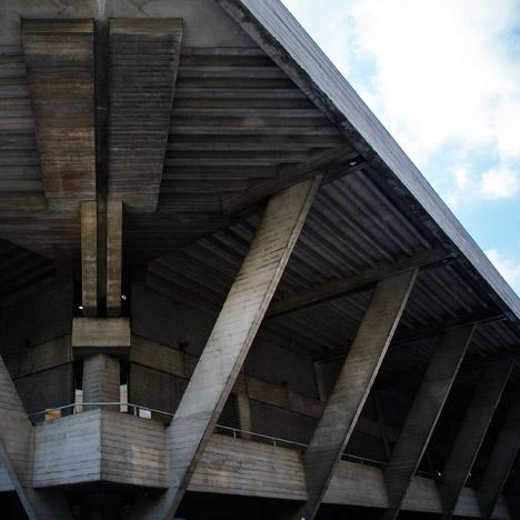

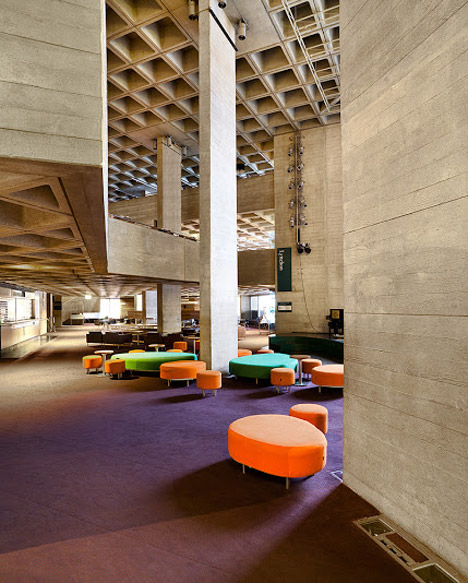


 Laura Woodgate